An Inside Look at the Strategy Behind a Website Design
Do you ever wonder why a designer chose specific elements for the website design? Why those colors? Why that floral illustration? Why that layout? If so, you’re in the right place because today I’m breaking it down using a recent website I built for Joy Filmz as an example.
Joy Filmz is a professional, storytelling, wedding videography company that captures the special moments of the wedding day and hand crafts them into beautiful, custom films. And these films are so beautiful that I literally cried while embedding them on her site! What can I say? I love love.
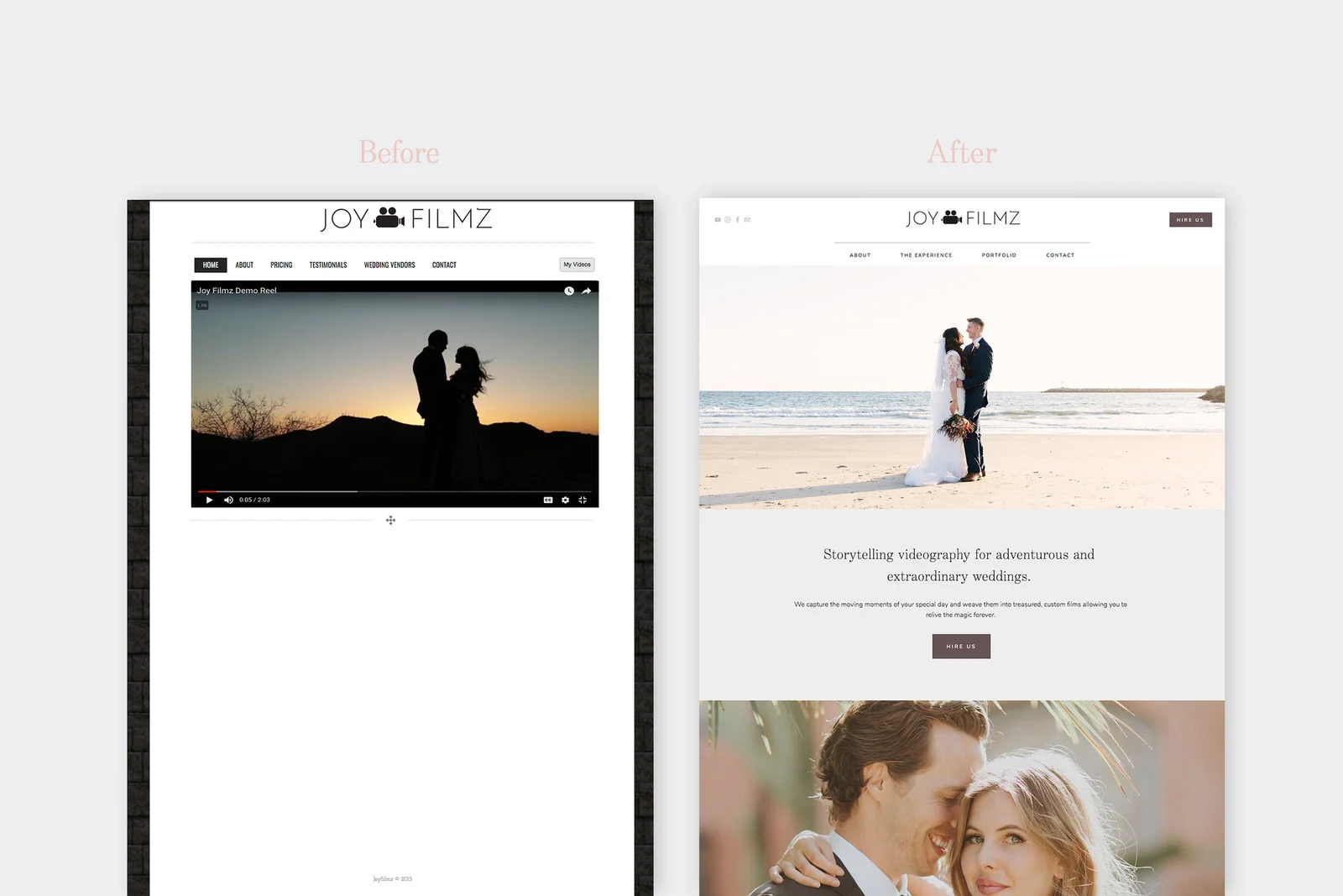
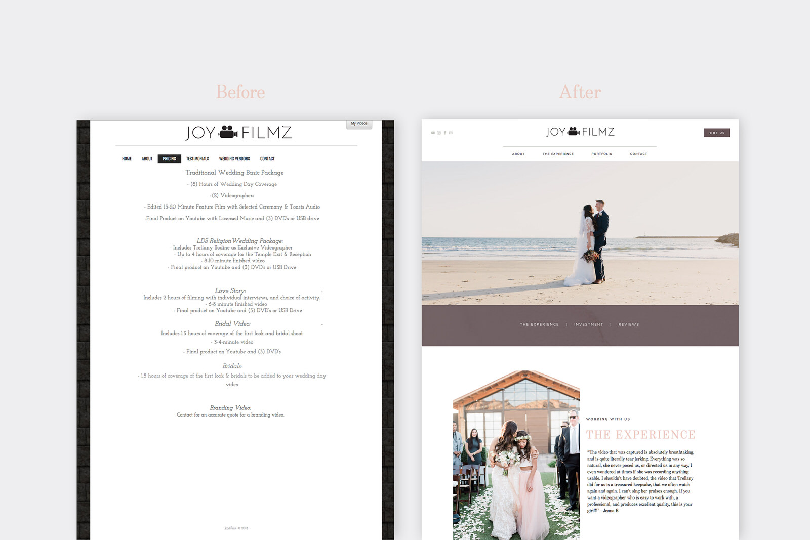
The owner, Trellany DIY’ed her original site, but after years of experience as a videographer, she felt her site didn’t accurately represent her brand and skill level. She wanted her website to match the luxury experience she provides her couples and I was so excited to build her a brand new website on Squarespace.
Gain Clarity
Before I even begin on the design, first I need to know the target audience, the main objectives of the website and how the client wants the website to feel. To get that information, I sent Trellany a design questionnaire that asks detailed questions about her business, mission, values, target audience, design preferences, desired mood of the design, and project goals. She also provided a Pinterest board with a few images that represented her brand’s design aesthetic for inspiration.
Create a Design Brief to Focus the Design
Once I received the Design Questionnaire, I took time to read it over thoroughly and then reviewed all my notes from our past emails and phone conversations. I use all that information to prepare a Design Brief that outlines the brand, target market, project scope, objectives and design preferences, to make sure that we are on the same page and to help guide the website design.
Design Brief Info
Target Market: Joy Filmz target audience includes females, aged 19-35, who are engaged to be married and are planning luxury, adventurous or destination weddings. These women are fun, organized, and kind. They are in search of a dependable, responsible, experienced, professional videographer with a unique, creative outlook and eye for detail, to capture the special moments of the day and craft those moments into a film that allows them to relive their wedding day forever.
Website/Brand Objectives: The main goal of the website is to portray Joy Filmz's professionalism, skill and luxury experience.
Desired Mood & Feel: Modern, minimal and luxurious
Gather Inspiration
Once Trellany approved the Design Brief, I started gathering inspiration. I love to use Pinterest for this step. On the Pinterest board, I included some of the images that Trellany pinned on her board, her logo, some of her brand images, wedding photos that fit the vibe and a few web pages that had features that Trellany mentioned she loves.
Put Together a Mood Board with the Main Design Elements
From this Pinterest board, I pulled a few images that perfectly fit the tone and design direction I wanted to go with the website design and added them to a Mood Board. From that imagery, I pulled out some of the consistent colors to create the color palette. Originally I selected four shades of each hue, but as I put together the mood board, the simplified version of just the five main colors looked best on the board, so I stuck with just those five shades. Next, I selected fonts, established text hierarchy, buttons, and graphics. Sometimes these things will change slightly as I build out the website, but this is a good framework to start from.
Image credit: Joy Filmz, Creative Market, Flash Film Weddings, @thehearnes, @kamacatchme, @boho1
Here is the thought behind all of the elements on the Mood Board:
The mood of the brand is modern, minimal, and luxurious. The imagery includes both adventurous and sweet wedding moments. Feminine elements-such as the bridal bouquets-appeal to a feminine market. The imagery is slightly moody and cinematic. The images showcase the unadulterated grandeur of nature - the harmonious juxtaposition of minimalism and luxury.
The color palette is a modern take on neutrals. In color psychology, purple is a royal, luxurious color. The deep, eggplant-grey tone is a modern take on purple that still evokes wealth and affluence. The warm, taupe-grey represents Joy Filmz’s welcoming, comfortable presence working with couples and their loved ones. The nude blush adds a subtle, feminine touch. The sage-grey and dark green-grey echo the natural elements present in their films-such as the bridal bouquet and landscape. The logo and text utilize black, which is an elegant and sophisticated color.
The shadow texture provides visual interest and dimension to the design while the gold, hexagon graphic adds a modern, geometric element. The fonts are minimal, modern and create an upscale look.
The buttons are an example of how the colors and fonts may be used on your website.
Build the Website
After the Mood Board is approved, I moved on to building the website. From setting up the header and footer navigation, inserting content, embedding demo reel and portfolio films, adding design elements, adjusting styling using custom CSS code, adjusting mobile and tablet views, adjusting backend settings, embedding 17Hats lead form, and setting up social media integrations, this part of the process takes about 2-3 weeks.
Website Strategy
Whenever I build a website, my main goals are to make it user-friendly, easy to navigate, and to meet the project objectives outlined in the Design Brief.
To make the Joy Filmz website easy-to-navigate and user friendly, I provided multiple ways to get to each section - in the heading, in the footer and on the main home page.
I kept the main navigation minimal with only the most important pages and a clear call-to-action button so as not to overwhelm website visitors with too many choices.
With the popularity of Instagram and Facebook, we are trained to scroll. Therefore, I kept the home page long and included several different sections that linked to the different pages of the website along with call-to-action buttons.
Some people love to scroll straight to the bottom of the site looking for a site menu, so I added a full menu of all the webpages in the Footer.
Every page utilizes the same design elements for consistency and includes clear calls to action.
The Modern, Minimal, Luxurious feel is created with lots of white space, moody images and minimal design graphics.
This website includes lots of useful features such as:
An auto-playing demo-reel at the top of the home page so that it’s the first thing website visitors see.
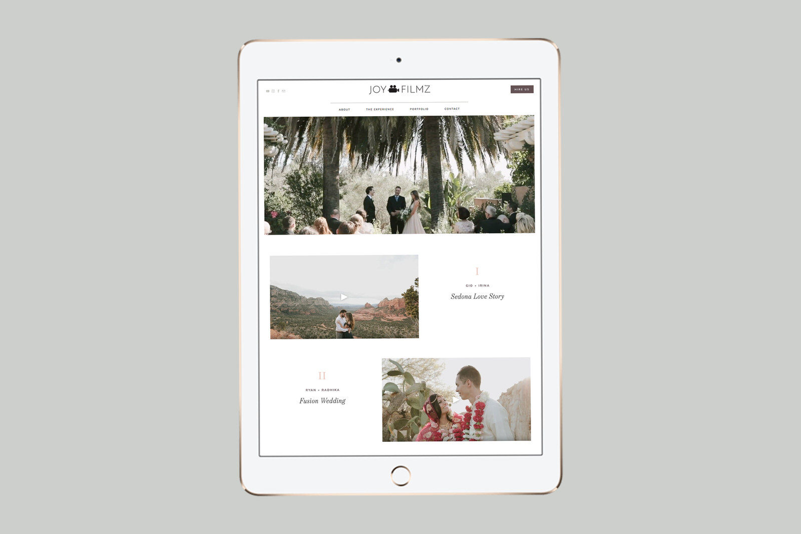
Embedded Portfolio Films so that website visitors can watch the films without leaving the website.
A carousel of reviews that visitors can easily scroll through.
Embedded 17Hats Form to streamline the booking process.
Auto-updating Instagram Feed in the Footer so that people can easily connect with her social media.
An availability calendar to show what dates she has available to film weddings.
The website design went through two rounds of revisions to make sure it was perfectly aligned with Trellany’s vision. After the edits are complete, I hosted a live video call to teach Trellany how to use her new website and then we launched that beautiful new website (if I do say so myself) to the world!
“[Megan] did an AMAZING job at portraying my passion, work, and professionalism through this website. I cannot thank her enough for her hard work!”
Inspired by this post and ready to take your DIY site to the next level with a custom website?


