After moving to the Caribbean and having a friend put together a simple website for her new business, Alexandra realized she desired a more comprehensive design experience with a logo design, brand direction, and full bilingual website.
TARGET MARKET:
Motivated males and females, 40+ years old, suffering with eczema or with children suffering with eczema, who are searching for alternative, holistic methods of healing.
THE MOOD:
Natural, classy and luxurious. In her words: “An elegant French touch with a Bohemian California spirit, a serious welcoming place to feel home with real solutions to their problems, a place to be heard.”
THE PROCESS:
I worked with the lovely graphic designer-Shannon Withaeger-to design the logo and then put together a brand direction board with mood images, font pairings, color palette, and textures to guide the design elements of the brand.

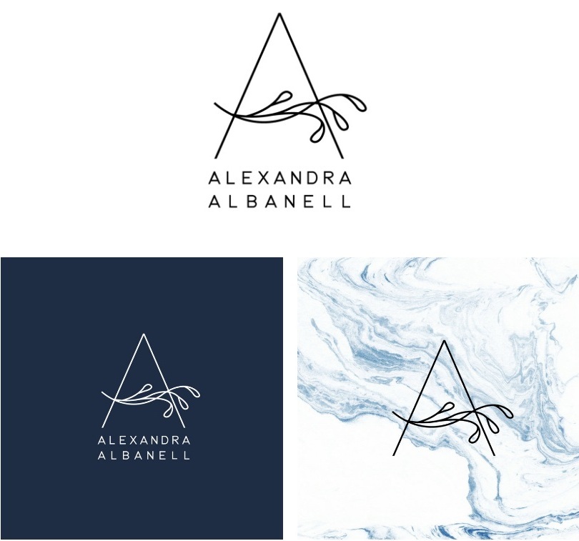
The logo incorporates a clean, chic letter “A” with a branch, symbolizing Alexandra’s role in helping people implement a plant-based diet and holistic healing. It is elegant, luxurious and reminiscent of the plants that can bring forth healing.
Textures & graphics take their cues from nature, echoing the brand’s values and mission of a plant-based diet and mindful living.
The main black, white and grey color scheme is sophisticated and timeless. The warm accent gold is luxurious. The orange accent color is friendly and welcoming. The inky blue is classic and conveys a sense of reliability.
Body font is modern & easy to read. Accent font is personable. Both support Alexandra’s empathetic and personable tone.
Language Selector
Custom code allows web visitors to select either English or French to view the content in their preferred language.
Bilingual Site
Caters to Alexandra’s broad audience.
Page Sections
Break up text-heavy pages.
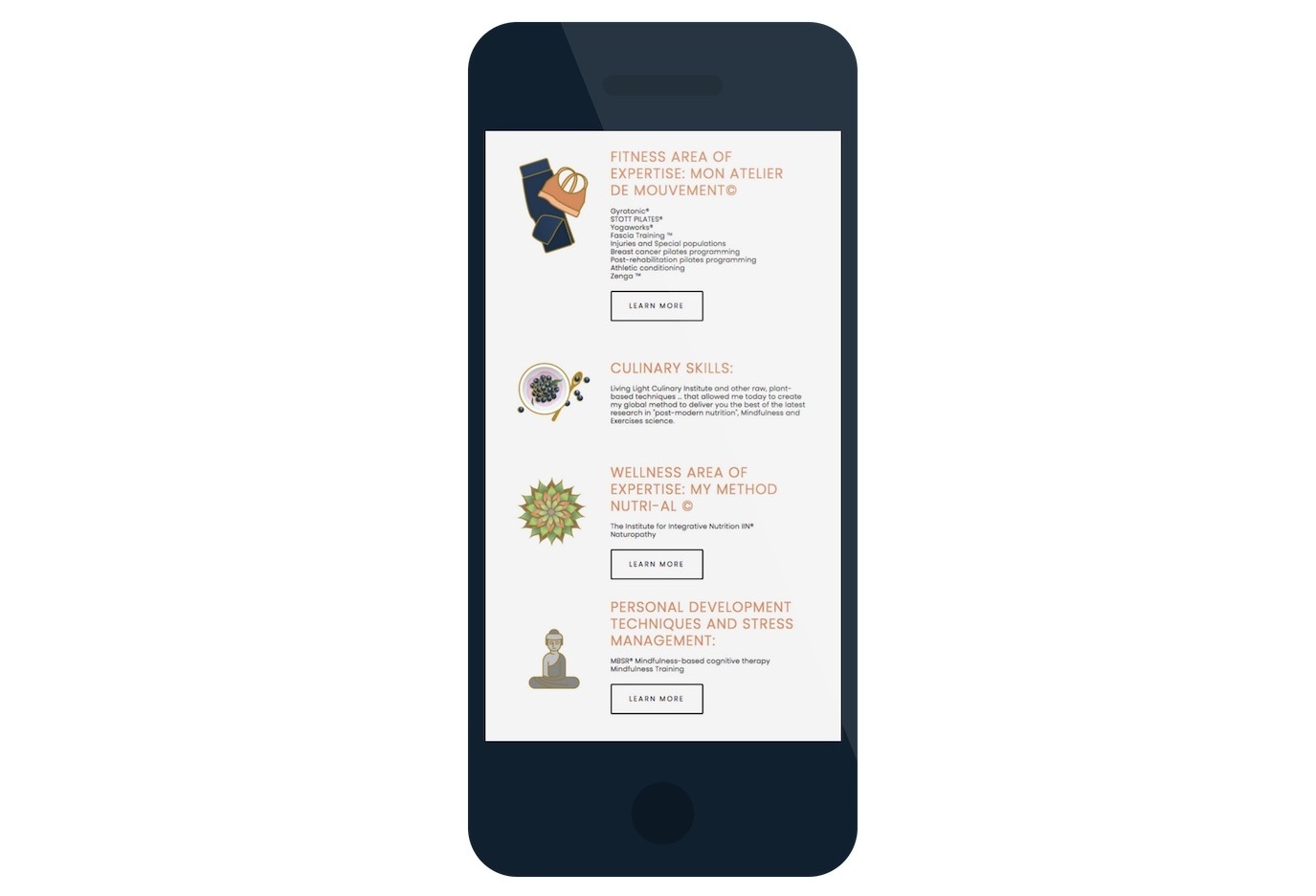
Mobile Responsive
The web design changes to fit the device.
Custom Icons
Visually represent each offering and help to visually break up the text.
Interactive Q & A
Answers appear when the question is selected.
The Blog
Includes blog post templates allowing for both English & French versions of the text, automated post suggestions, and an opt-in where users can get Alexandra’s free E-Book when they subscribe.
Blog Post Graphic
I designed pin-able blog post graphic templates in Canva that are easily customized for each blog post.
Business Card
Design echoes the brand colors and textures.
Domain Email
Set-up through G-Suite, connected site, and custom email signature design.
Site Analytics
In addition to Squarespace analytics, I also set-up Google Analytics & Google Keywords, as an extra way to track site traffic.
Digital Forms
Rather than wait on snail mail, clients can now complete their health history form online and submit it straight to Alexandra’s inbox.
Opt-Ins
On every page, where web visitors can download Alexandra’s free E-Book in exchange for subscribing.

